Ad Widget

Collapse

Announcement

Collapse
No announcement yet.

Replacement PAF and PAT# decals

Collapse
X
 
  • Filter
  • Time
  • Show
Clear All
new posts

  • Replacement PAF and PAT# decals

    A few months back I needed a replacement Patent # decal for a rewind. The customer really wanted one, and I couldn't find one. So I had a guy with one of those Alps printers make me a set. I wasn't thrilled with the gold foil appearance. So I set out on mission to have some made the old way. I found a local shop that still screened waterslides using the old lacquer based inks. But it was a chore getting what I wanted done. They kept trying to "clean up" the art, make things proportionate. These are the closest they got. If you pick it apart, there are differences, and that is okay with me. I just wanted the general style and flavor, not an indistinguishable replica.

    Here are my sample applications.


    Let me know what you guys think.

  • #2
    Originally posted by Jim Shine View Post
    A few months back I needed a replacement Patent # decal for a rewind. The customer really wanted one, and I couldn't find one. So I had a guy with one of those Alps printers make me a set. I wasn't thrilled with the gold foil appearance. So I set out on mission to have some made the old way. I found a local shop that still screened waterslides using the old lacquer based inks. But it was a chore getting what I wanted done. They kept trying to "clean up" the art, make things proportionate. These are the closest they got. If you pick it apart, there are differences, and that is okay with me. I just wanted the general style and flavor, not an indistinguishable replica.

    I make my own using a Xerox 8500 solid ink printer and the ink jet decal paper. I get a horrible yield it is like 20% but here's what it comes out like. Part of the color shows through from the baseplate, and that makes it come out kind of vintage looking. I use a couple of coats of Krylon on the decal paper. Had to fool around quite a bit with the original word file to get it looking halfway vintage with the greenish tinge on the edges.

    Click image for larger version

Name:	PAFModel2.jpg
Views:	1
Size:	547.5 KB
ID:	825760

    Edit: Jim, I plumb forgot to mention yours look good. Don't know what I was thinking, that's why I started the reply in the first place. I especially like the P.A.F. one.

    I also tried the one from the guy on EBay from Hong Kong and was not much impressed. Too modern looking. Especially for the price.
    Last edited by SonnyW; 08-16-2012, 11:40 PM.
    www.sonnywalton.com
    How many guitars do you need? Just one more.

    Comment


    • #3
      Originally posted by Jim Shine View Post
      Let me know what you guys think.
      Looks good!
      It would be possible to describe everything scientifically, but it would make no sense; it would be without meaning, as if you described a Beethoven symphony as a variation of wave pressure. — Albert Einstein


      http://coneyislandguitars.com
      www.soundcloud.com/davidravenmoon

      Comment


      • #4
        Both Jim and Sonny's look great!


        Rob.

        Comment


        • #5
          Yes ...both look great
          "UP here in the Canada we shoot things we don't understand"

          Comment


          • #6
            Thanks! I worked primarily with a guy named Roger on them. He has been in the screen printing business since the 70's. He felt the PAF logo was one of the numerous Futura fonts, burned onto a larger than appropriate mesh count screen, this distorted the "resolution" of the final art screened. He selected the font from an old typeface book, but used a finer mesh for the screen.

            Comment


            • #7
              Originally posted by Jim Shine View Post
              Thanks! I worked primarily with a guy named Roger on them. He has been in the screen printing business since the 70's. He felt the PAF logo was one of the numerous Futura fonts, burned onto a larger than appropriate mesh count screen, this distorted the "resolution" of the final art screened. He selected the font from an old typeface book, but used a finer mesh for the screen.
              I was thinking Futura also. I remember there used to be the Lettraset wax transfer letters that had the Futura fonts. They were pretty common in the 60's and 70's at least, and probably in the 50's too but I was too young then to pay attention. Most of the office supply places stocked them. That transfer lettering is what we used for making some of the artworks that we used for PC board silk screens where I worked in the early 70's. We would lay the artwork out 5x or 10x size and shoot it down to size with a big old copy camera. That would also account for the hand kerning, which is what we did. I think the practices in that shop I worked in in the early 70's hadn't changed much from the 50's. It was pretty much the same in newspapers too at the time for laying out ads.
              www.sonnywalton.com
              How many guitars do you need? Just one more.

              Comment


              • #8
                I know what you mean by that camera. It would reduce the size and burn the image. I have seen decal runs where the camera was knocked slightly out of its original position and created a slight increase or reduction in the image burned in the screen, making a "off" size image. I think that same thing may account for why some batches of PAF labels have slightly larger black areas and/or larger clear areas than other batches of these logos. It was a new screen burn and the camera was not set to reduce the image exactly the same as other burns.

                Comment


                • #9
                  Originally posted by Jim Shine View Post
                  I know what you mean by that camera. It would reduce the size and burn the image. I have seen decal runs where the camera was knocked slightly out of its original position and created a slight increase or reduction in the image burned in the screen, making a "off" size image. I think that same thing may account for why some batches of PAF labels have slightly larger black areas and/or larger clear areas than other batches of these logos. It was a new screen burn and the camera was not set to reduce the image exactly the same as other burns.
                  Our camera was huge. It had it's own room. It was pretty much made like a giant Hasselblad. The artworks were as big as 48 inches across. The main lens moved on rails and they had thumbscrews to lock the position. We had the reduction positions marked, but it would have been easy to get the reduction a bit different each time. The screens didn't last a very long time and we remade them frequently. Nowdays the mesh is tighter and the screens are stainless instead of silk as back then too.
                  www.sonnywalton.com
                  How many guitars do you need? Just one more.

                  Comment


                  • #10
                    Cool thread!

                    Though I prefer to use my own branding on my pickups, I do use the same type of lacquer decals and have spent quite a long time looking into creating accurate PAF decals.

                    There seems to be no standard font that fits the bill. I'd guess the lettering was stenciled, originally. I think this is the main problem with most of the decals out there. People are using Futura or some other font, and possibly modifying it or moving the letters around. I've tried that. Doesn't work correctly. I ended up taking several very high resolution scans of different original PAF decals (I owe some thanks to a "skatter-minded" colleague for that!) and spent many hours going pixel by pixel in Photoshop to draw over the scans as objects that would translate into a vector, resulting in some very high quality digital files that accurately represent several different original PAF decals. No fonts used, these are images/objects based on scans of the originals.

                    As can be seen, not all the PAF decals have the same amount of gold paint applied. Most I've seen have lots of paint, resulting in the big round letters that rise above the surface, but some have much less. I think the trick to properly reproducing an accurate looking PAF decal, is to start with a scan of a vintage PAF sticker that DIDN'T get a huge amount of ink applied. This will give a more true representation of the original size and shape of the letters. THEN once the screen is prepared based on that thinner one, lay the paint on THICK so the letters swell up and give that fat look where the A's and R's are sometimes filled in almost completely.

                    Also, I suspect that the gold paint used for these decals was the same paint as the "Les Paul" signature on the headstocks. It seems that luthiers reproduce that pretty well these days so a recipe shouldn't be hard to find. I'd wager to bet that Gibson just used that same gold paint, as it was already prepared in the shop. It seems "very Gibson" to just grab the nearest existing solution and just make it work to get the job done.

                    ...now if only I had silkscreening experience. lol!

                    Comment


                    • #11
                      The gold is clear screening "ink" mixed with bronzing powder. Basically the same material used for Les Paul gold tops, but the alloy is different (for color) and the flake size is different and made just for screening. I apprenticed under a luthier in Michigan and Gibson was that shops specialty. The "Les Paul" logos were not all that was screened. Until the 50's all the guitars that had gold Gibson logos on the heads were screened as well.

                      While I am familiar with screening in that regard, I never had to make the screens. They were there before I ever arrived.

                      The problem we face now with fonts is people are relying on what is available digitally. Anyone that has spent any time reproducing any old items with fonts will tell you it is quite common to find the modern digital example is not 100% the same. Helvetica is a great example of this as is Futura. Often you have to look beyond the digital realm to get what you need.

                      Futura is a more of a font family than one font. The Pat # decal is also in the Futura family. But so is the ESP logo, which looks nothing like "Futura", but it is. There are hundreds of fonts in the Futura family. Who knows how many never have been digitized, or how many differ slightly after being digitized.

                      And no, I will not put my own brand name decals on a rewind.

                      Comment


                      • #12
                        Now, lets also factor in, on top of font available, the effects the whole screen process has in the final look.

                        This art is 100% from scratch using a Futura font. It had crisp D shapes inside the P's and R, and a triangle shape inside the A's. Now keep in mind the screen mesh was INCREASED for this run as the guy refused to "Half ass" his work. Note what happened inside these letters.


                        The outsides of the letters also became "rounder", smoother, less defined. Imagine how these would have looked had the larger mesh had been used?

                        Now imagine if I used Illustrator and built an EPS file of this logo available on the net and had it burned to a screen:


                        Imagine how wrong it would have looked once these same influences that smoothed out and distorted the original, clean and crisp characters affected this pre-distorted art the same way.

                        It is easy to get really anal with the precision computers give us. But the way it was done back then was less than precise and no where near the quality of reproduction we are able to create at home today.
                        Last edited by Jim Shine; 08-18-2012, 11:23 AM.

                        Comment


                        • #13
                          Jim, I'm with you. That's why I had started with a very lightly inked example of the decal. The letters were very crisp, and it was as good as I could get short of finding a stencil of the actual font used. In a way though, having the scan of an actual sticker (well, several, really) was very helpful in the letter/word spacing, as well. I don't know much about silk screening, but what you say makes perfect sense. I knew that the gold on the stickers could not be the same as used on the GT guitars, as I've never seen it greening from age, and as you said, the flake size is obviously different.

                          btw - Just to be clear - I wouldn't put my own branding on a rewound vintage pickup either. I just meant on my own replicas, I use my logo, not PAF decals.

                          Comment


                          • #14
                            Originally posted by Jim Shine View Post
                            The Pat # decal is also in the Futura family. But so is the ESP logo, which looks nothing like "Futura", but it is.
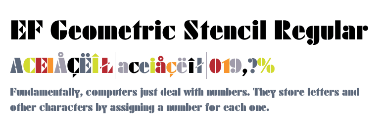
                            No it isn't. It's EF Geometric Stencil Regular.


                            EF Geometric Stencil Regular - desktop font - Fonts.com

                            This is the Futura family:


                            You might have been thinking it was Futura Black, but it's not.
                            It would be possible to describe everything scientifically, but it would make no sense; it would be without meaning, as if you described a Beethoven symphony as a variation of wave pressure. — Albert Einstein


                            http://coneyislandguitars.com
                            www.soundcloud.com/davidravenmoon

                            Comment


                            • #15
                              Futura Black BT

                              Click image for larger version

Name:	FuturaBlack.gif
Views:	1
Size:	12.3 KB
ID:	825789

                              This font goes back to 1929.

                              Comment

                              Working...
                              X