Originally posted by Freekmagnet
View Post
Ad Widget
Collapse
Announcement
Collapse
No announcement yet.
Advertising Swag
Collapse
X
-
Originally posted by Freekmagnet View PostWoah, I'd call this more of an illustration than a logo. Don't get me wrong, I think it looks really nice. I design logos for a living, and usually it's best practice to make designs with one or two colors and no photographic images. I'd really recommend coming up with a one color alternate for printing.
.....Or you could hire an illustrator to replicate that wolf's head. That could be pricey as well.Originally posted by WolfeMacleod View PostThat was already done (twice, actually). The previous logo was so small and low-res that it was unsuitable for printing at all.
Logos should be simple. You can depict a wolf without showing every hair on its head. Capisce?DON'T FEED THE TROLLS!
Comment
-
I like Wolfe's logo myself.
That being said... your logo is something personal to yourself and the way you chose to display your creations to the world.
If Wolfe wants a naturalistic wolf instead of a cartoony one, its his choice and his own artistic statement to make.
ken
Actually, I'm kinda sorta wondering how come Wolfe's logo and mine are the only ones in here?
Comment
-
Originally posted by rjb View PostSounds to me like we're all talking past each other.
Logos should be simple. You can depict a wolf without showing every hair on its head. Capisce?
Originally posted by ken View PostI like Wolfe's logo myself.
That being said... your logo is something personal to yourself and the way you chose to display your creations to the world.
If Wolfe wants a naturalistic wolf instead of a cartoony one, its his choice and his own artistic statement to make.
ken
Originally posted by ken View PostActually, I'm kinda sorta wondering how come Wolfe's logo and mine are the only ones in here?
Comment
-
personally I hate the feel of them when my arm brushes across, but there are those shirts with the iron on full color image. The picture feels sorta plastic to the touch. But any image even photographic can be put on a shirt decal and pressed on.
I think the full detail wolf image logo is very attractive. Is it necessary to have the same full detail image on the shirts? What goes on the magazine page or the box cover or a sales brochure is one thing, but a T shirt might have a characterization of that image without the detail.
I mean this looks good on a shirt and is instantly recognizable as a Corvette withou tlooking like a photo o r taking anything from the real product:
Education is what you're left with after you have forgotten what you have learned.
Comment
-
Originally posted by ken View PostI like Wolfe's logo myself.
That being said... your logo is something personal to yourself and the way you chose to display your creations to the world.
If Wolfe wants a naturalistic wolf instead of a cartoony one, its his choice and his own artistic statement to make.
ken
Actually, I'm kinda sorta wondering how come Wolfe's logo and mine are the only ones in here?
That would make at least 3 of us
Now that I remember, I guess Fuchs also uses his own as avatar.
I bet if you look around, you´ll find many moreJuan Manuel Fahey
Comment
-
I've done a few logos for different ventures I've undertaken. There's something to be said for simple and something to be said for extreme To each their own! Here's a few of my own;
Sigil Pickups: I love the copper tones and antique look, but it cleans up really well in one color. The full scale version has a ton of textures and little runes that go around the outer ring but most are lost on compression.
Actually, this one shows it better
Stunt Monkey Pedals, pure text with a yellow backdrop.
and the monkey!
Comment
-
Full Impact MMA with Hardcore Expansion (MMA Dice Game) This one was early in the game and really sucks for all things...screen, print, Everything!
Also early, for a friend's Wrestling Dice Game. I think I was using a logo creation program for these ones. Now I just use Photoshop.
and the latest venture;
Comment
-
CheopisIV
Full Impact MMA with Hardcore Expansion (MMA Dice Game) This one was early in the game and really sucks for all things...screen, print, Everything!
Sigil Pickups: I love the copper tones and antique look, but it cleans up really well in one color. The full scale version has a ton of textures and little runes that go around the outer ring but most are lost on compression.
All of you who 'just' use Photoshop or whatever are extremely talented and lucky too. All I had to do to get my idea and logo at the same time was take
my extremely artsy, extremely stoned love of my life to her first major flea/junk market and let her root around... but I digress
Cartoon wolves are used almost exclusively in the '40s and '50s rockabilly/Americana music scene, especially the leering 'Tom and Jerry cartoon wolf' kind.
I'm not sure that is the market Wolfe wants to be in.
Right now, I'm coming up with bumper stickers, a 2 or 3" round sticker for guitar cases, and a logo for guitar picks too. A T shirt would be a bumper sticker's art just bigger I guess.
ken
Comment
-
I only ever printed the books in black and white, the red dots were actually holes in the font and I was able to put a red layer behind to make them pop. I still like the text but I have no idea what I was doing with that swoopy thing behind it. That one was done in Flash and the Wrestling logo started in a Logo Making software and moved to Flash later for better control. Man, those were the days! Flash was gaining headway as the biggest thing since sliced bread and Flash websites were all the rage...and very lucrative. Then along comes Apple with the iPhone and they killed Flash dead in it's tracks. The claim was they didn't support the monopoly Adobe had with Flash development. Such hypocrites!
Comment
-
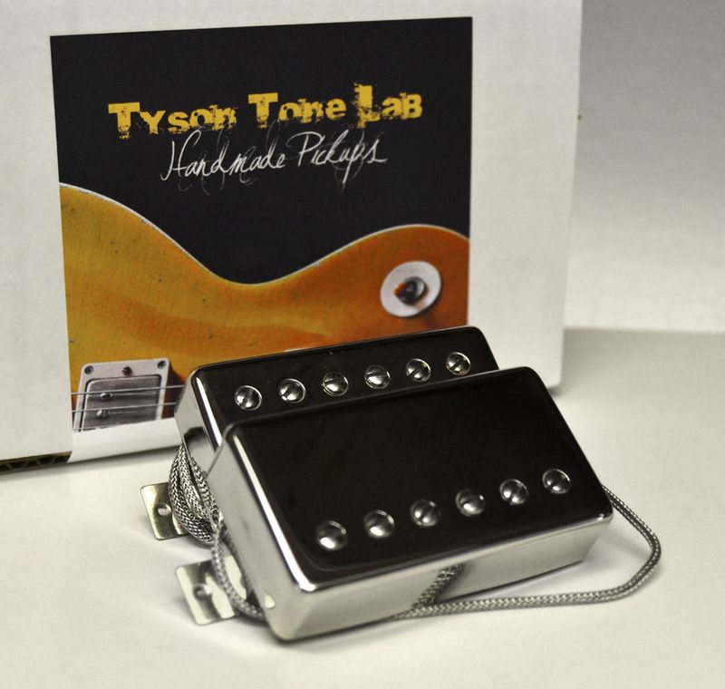
David, Funny - used the same font as in one of your old designs. I knew it was not going to really translate well as one color and went against convention and common sense but did it anyway : )
Here's the new n improved Logo (don't mind the shadow)
-Which the elements can be used in diff shapes etc, which is really useful for a proper logo IMO, like here:
Bobby, www.TysonTone.com
Comment
Comment